Case study · A conservation nonprofit site, rebuilt accessibility-first
Monkey Rescue
A four-page marketing site for a concept wildlife-conservation nonprofit. Originally a first-year college project; rebuilt in 2026 into a modern, fully responsive and accessible static site — tokenised design system, scroll animations, interactive donation widget. No frameworks, no build step.
01
The problem
The first-year-of-college version had four duplicated stylesheets, deprecated markup, fixed pixel units, and zero accessibility consideration. Returning to it four years on, the question was: how do I rebuild it with what I know now — without abandoning the original design language?
02
The approach
Consolidated four duplicated stylesheets into one design system driven by CSS custom properties (color, spacing, shadow, type scale). Replaced deprecated markup with semantic HTML5 landmarks. Switched to mobile-first responsive layout with CSS Grid, Flexbox, and fluid clamp() typography. Added vanilla JavaScript as progressive enhancement — hamburger menu, animated impact counters, scroll-reveal sections, and an interactive donation widget with a live impact estimate.
03
My contribution
Sole designer and developer for both versions — the 2022 original and the 2026 rebuild.
04
What I learned
Returning to my first-year project let me see how much my thinking had matured — from physical cm units and copy-pasted stylesheets to a maintainable design system, semantic markup, and an accessibility-first mindset. The biggest lesson was treating CSS as architecture rather than decoration.
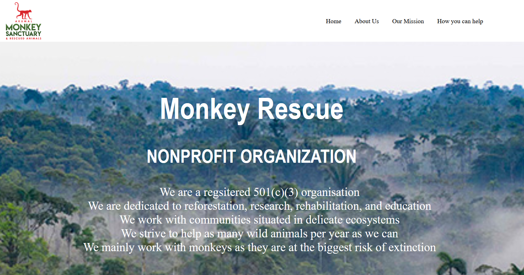
The website for a (concept) nonprofit focused on rainforest reforestation, research, rehabilitation and education. The 2026 rebuild kept the original feel but replaced almost everything underneath: four duplicated stylesheets became one tokenised design system, deprecated markup became semantic HTML5, fixed pixel units became fluid clamp() typography. Interactive touches were added in vanilla JavaScript as progressive enhancement — the site still works with scripts disabled.
Key features
- Tokenised design system — one stylesheet powered by CSS custom properties (color, spacing, shadow, type scale), replacing four duplicated files.
- Mobile-first responsive layout — CSS Grid + Flexbox + fluid
clamp()typography. - Accessibility-focused — semantic landmarks, skip link, ARIA labelling, keyboard-operable nav and modal, visible focus rings,
prefers-reduced-motionsupport, and a<noscript>fallback. - Interactive donation widget — preset and custom amounts, one-time vs. monthly toggle, a live impact-estimate readout, and an accessible thank-you modal.
- Subtle motion — animated stat counters and scroll-reveal sections via
IntersectionObserver. - Progressive enhancement — every page is fully usable with JavaScript disabled.
- Performance & SEO — lazy-loaded imagery, privacy-friendly video embeds, meta descriptions, Open Graph tags, and an inline SVG favicon.
- Zero dependencies — no framework, no build step; deploys straight to Netlify on every push.
Project metadata
- Type — Front-end / responsive web design
- Role — Designer & developer
- Timeline — Originally 2022; rebuilt 2026
- Tooling — Git + GitHub, Netlify CI (auto-deploy on push)